Creating a new website for Hopper, one of the top 4 most downloaded travel apps in the U.S, along with Uber, Lyft and Airbnb is no easy task. It’s critical to communicate to the world the brilliance behind Hopper and the people driving this rapidly-growing app.
Our journey began with discovery, understanding the key values of both Hopper as a product and as a company. Familiar with the former, we chose to delve deeper to appreciate the people that push the boundaries of travel.
The depth of understanding regarding company culture, coupled with the sheer continuity among answers, was impressive. It didn’t take us long to discover that Hopper held something special, reaching far beyond their immediate product offering — they’re revolutionizing how millions of people book travel every single day, with a team that’s equally ambitious.

The goals for Hopper.com
Present Hopper’s product to the world
Reveal the company that’s pushing travel forward
Highlight the amazing people behind the Hopper app
Increase talent density
With our immediate goals established, it was time for Narative to begin building, collaborating, and executing on our ideas.

The new Hopper.com had to be simple, our discovery interviews enabled us to easily identify both what was important and what should be prioritized.
Hopper.com is a platform which makes their product, company, and people the focal point, with the goal being to increase app downloads, company awareness, and talent density.
We stripped away the unnecessary clutter and focused in on the message we wanted to deliver. The navigation is simple, highlighting the company, people, and support. A small footprint meant we could deliver a phenomenal experience on a few pages rather than a mediocre experience on a number of them.

Designing the right experience
Hopper carries great strength within its brand and product, something we needed to preserve while expressing the identity of the people behind it. Our main goal for design and communication was to showcase the culture of Hopper.
Homepage: Communication is focused around the app, features and popular travel destinations. It was important to inspire visitors when they landed on the homepage.
Company: Hopper as a company, physically, and Hopper as a group of talented individuals, building a product to help people travel the world.
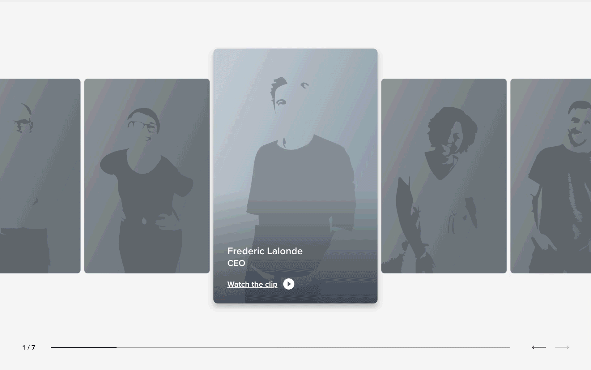
People: This is where we shine the light on Hopper Humans. The focus being the individuals that make Hopper and its culture.
The Design process took the form of 3 main phases:
Firstly, our communication design team gathered a wealth of information from Hopper’s discovery, distilling the learnings into what we call “performance copywriting”.
Next, this is translated into a lo-fi wireframe with a rough visual structure. Once we have these lo-fi wireframes in place, we can begin building a prototype to be used in our initial user tests. This is important as we’ll finalize all content and structure for the website before progressing to the final step.
The last step for design was working closely with Hopper’s in-house team to produce assets including illustrations, photos and videos. This is where the Hopper brand truly takes shape. For this project in particular, Hopper chose to have their own writers adapt our performance copywriting to match their brand’s voice and tone.

Working with Hopper’s in-house illustrator Fitz was a blast. During our collaboration, we kept in mind which pieces of his work could be translated and decomposed into code whilst maintaining technical performance. With a talented illustrator, it’s easy to go overboard and insert beautiful pieces everywhere, but this can also subtract the human aspect of Hopper, which we desired to highlight. Consequently, we were diligent in our illustration placement and made sure to balance this with photos/videos of real people. In the end, we created the perfect balance of playful illustrations with a human touch.
Technology
For each of our projects, we strive to use world-class tools. Our team decided to build Hopper.com with Gatsby (we’ve even written about Why Narative loves Gatsby).
Gatsby is a modern website framework that builds performance into every website by leveraging the latest web technologies. It allows you to create blazing fast, compelling web experiences without needing to become a performance expert. This allowed our team to focus on the story, content, and details required to create the best user experience possible. The developer experience and plugin system meant we could work faster and focus on the people that would be visiting Hopper.com.
React is taking over the web and Gatsby allows our team to build websites with a familiar API, the same libraries, and patterns we’re already used to.
Gatsby also made it simple to pull in data from any source. This meant we were able to create a CMS with Contentful, giving full scope content management to the editors and writers at Hopper. We also used other data sources, such as Greenhouse, to build a custom careers section. In the near future, Gatsby Preview will connect the final dots of a seamless editing experience through a CMS.
Performance
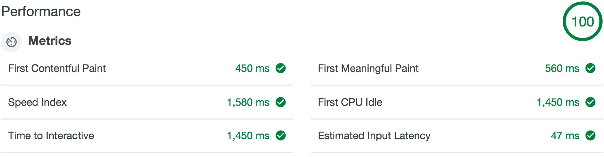
Desktop, no throttling
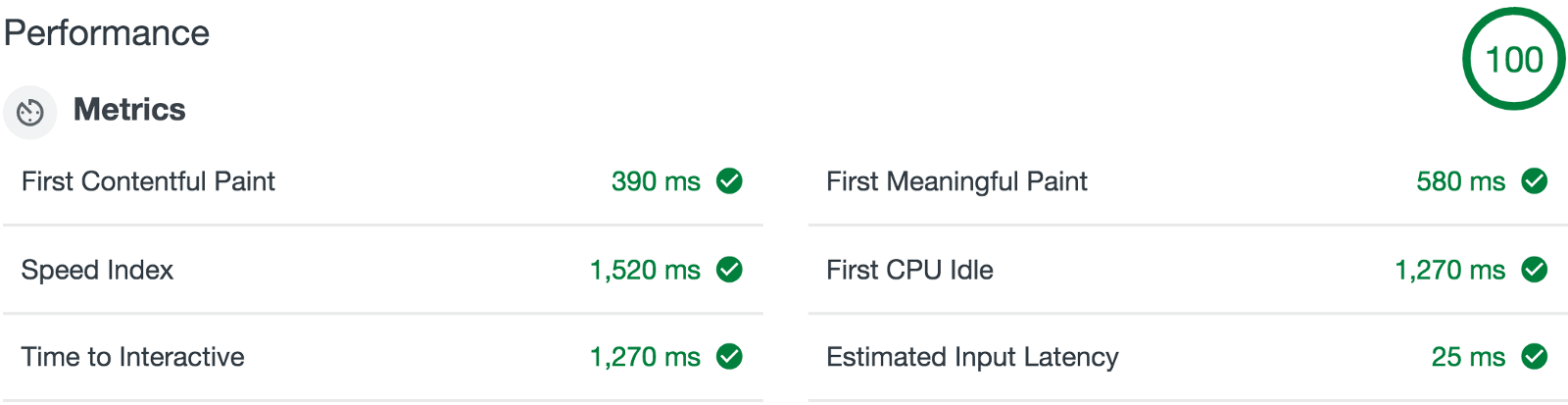
Mobile, no throttling
Understanding the key metrics for what you’re looking to achieve is far more beneficial than ticking a list of industry standard checkboxes. It was critical for Hopper’s web experience to reflect their Application.
Our results were impressive, both on mobile and desktop devices, with 0 throttling. We were able to achieve First Contentful Paint at around 390ms with a speed index fo 1520ms, on mobile.
Creating a memorable experience

The hero is a significant part of any page. It’s guaranteed to receive the highest percentage of views and must be loaded quickly while conveying the story we desire to tell.
To accomplish this, we knew loading a large image could take seconds to render, especially on slow connections, so we took the original illustration and broke it down, piece by piece. First, we recreated the illustration’s background using a CSS linear gradient and the clouds as an SVG. This ensures there’s no white screen while the navigation is visible on load. Both the CSS and SVG are inlined in the HTML so they’re prioritized over non-critical assets. Second, we lazy load in 4 static images: 2 textured clouds, a plane, and a cityscape.
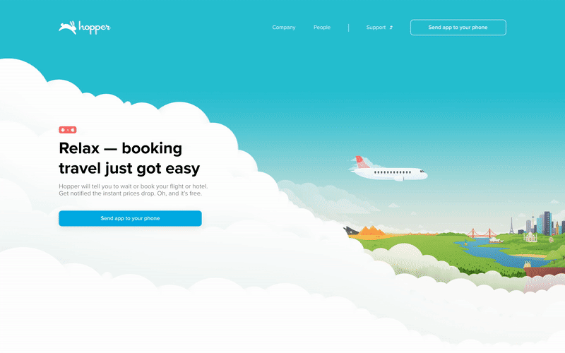
Beyond technical optimizations, we wanted to add some interactivity and life to the hero. When visiting Hopper.com on desktop, depending on the time of day, we dynamically generate a Day and Night mode — with the same multi-layered optimizations for both. When visitors scroll down beyond the hero both the clouds and city float up, giving an airy feel to the page.
Hopper’s Images
Rather than presenting a generic list of employees and their portraits, we decided to create a dynamic grid of randomly selected photos for each Hopper Human, forming a unique experience whilst proudly displaying the tremendous talent that calls Hopper home.
The People Grid is compromised of over 140 images randomly selected on each load. Each tile in the grid has around 20 unique portraits it can select from. This means each visitor to the page has a %0.000000546875 chance of viewing the same arrangement of Hopper people.

Since we’re loading a random set of images it’s hard to optimize and cache all the dynamic assets. To help with the loading experience we’re using SVG traces of each person and setting a solid background on each element while the image loads. This was possible thanks to gatsby-image and some clever JavaScript. Furthermore, all the images on Hopper.com are using the full benefits of gatsby-image.
Images are heavy assets that can slow website performance, especially on mobile devices with poor connectivity. Wherever possible, we aimed to replace raster images with SVGs or CSS. A fantastic example of this is the device reveal on the home page. The device is created with HTML and CSS, meaning we’re able to make it both interactive and animated.

Reflecting Hopper’s playful and quirky tone, we felt it was important to delight visitors with small surprises. As an example, not only is the device interactive, the button is also functional in the device reveal.
We’ve left a number of easter eggs on Hopper.com to ensure we put smiles on people’s faces.
The results
We’re excited to officially reveal Hopper.com to the world.
Hopper’s desktop presence now combines an elegant display of product-focused communication, with a proud presentation of the talent and culture responsible for driving the intensely ambitious company